This article was sponsored by The Hungry JPEG. Thank you for supporting the sponsors who make SitePoint possible.
With a few notable exceptions, great typefaces are not like hit pop records. They don’t arrive like a flaming comet, burn bright and disappear just as quickly into the night.
Typography tends to be more of a slow burn – like a great off-broadway stage show. Over the course of a year, you might hear the whispers, the gradually warming reviews and the slowly increasing buzz. You should grab a ticket, right?
But then BAM! – the show hits Broadway and is now the hottest ticket in town. You missed your shot.
Today, I want to spotlight 7 fonts that I hope are on their way to Broadway. Each is thoughtfully designed, unique, and under $20.
1. Albori Sans
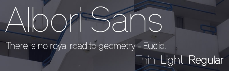
Let’s start with Albori Sans – a laser-sharp, geometric Bauhaus update. This is a typeface that looks as if it could have been crafted in a bicycle workshop. I’d love to see it used in neon signage.
It comes in Thin, Light, and Regular weights though in larger sizes I think it looks best in its laser thin variety.
Possible uses: High-end design, science, engineering, architecture, tertiary education, industrial design, aerospace.
- By Mankov
- Link: HungryJPEG
- Price: $10
2. Quincy CF
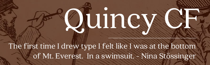
Quincy has a particularly lovely uppercase ‘Q’ and I suspect that explains the choice of name – a chance to show off the Q. It is a rounded, bookish serif font appropriate for use in body texts as well as headers. It’s available in 10 weights.
I like Quincy because it fuses together some nice characteristics from other big name serif typefaces. It has the old-school grace of Caslon, minus the stuffiness. It has some of the charm of Cooper without the goofiness, while bringing in the sensible respectability of a Georgia.
The low x-height means this is a typeface that never shouts, but always speaks in cogent, thoughtful tones. I could see Quincy working great in food, classical music or fashion blogs.
Possible uses: Cooking, creative writing, fashion, music, artisanal crafts, magazine layouts.
- By Connary Fagen
- Link: HungryJPEG
- Price: $15
3. Brela
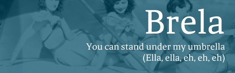
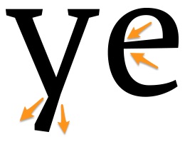
Brela is a sharp serif with a metal-cut punch to it. Although most glyphs maintain a sense of symmetry and balance, there is a jaunty edge to some characters that gives Brela extra life. For instance:
- The lowercase ‘y’ has a slightly wedge-shaped tail
- The lowercase ‘e’ has a tapering crossbar
Brela only comes in one weight, but hey, it’s free. What do you want for nothing?
The lack of variety in weights would probably prevent you from using it in any role that required a lot variety – magazine layouts for instance. However, that slightly irreverent edge makes Brela well-suited any branding that needs an upstart quality – which could mean anything from a financial services startup to an inner-city coffeehouse.
Possible uses: Startups, digital publishing, copywriters.
- By Makarskae Studio
- Link
- Price: Free
4. Madras
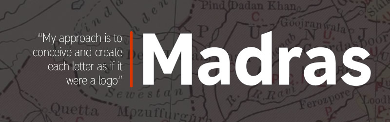
Madras is a beautifully polished sans-serif typeface that is so clear that it could be used for street signage if required. Brisbane-based designer Thomas Gillett has created a family with 7 weights and matching italics and you can grab two of them to try for free (the Extra Light and the Extra Bold Italic).
This is a very impressive and comprehensive package that includes all numerals, punctuation, ligatures, latin support, special characters and arrows.
In terms of usage, Madras is so flexible that it might be quicker to list applications it won’t suit.
- By Thomas Gillett
- Link
- Price: from $10 (Free for 2 weights)
5. Simple Hand
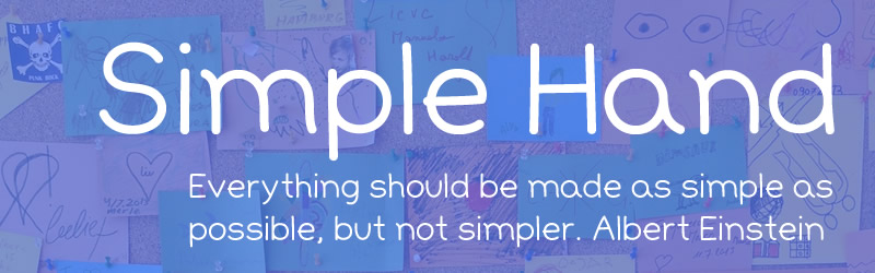
I know what you’re thinking: “*Seriously! A handwritten font?… What is this? Comic Sans Appreciation Day?*” But bear with me – I have my reasons.
Is ‘Simple Hand‘ lovely?
Is it even slick or professional?
Probably not. Nevertheless, I’d argue it does have an ideal use case in the current design climate.
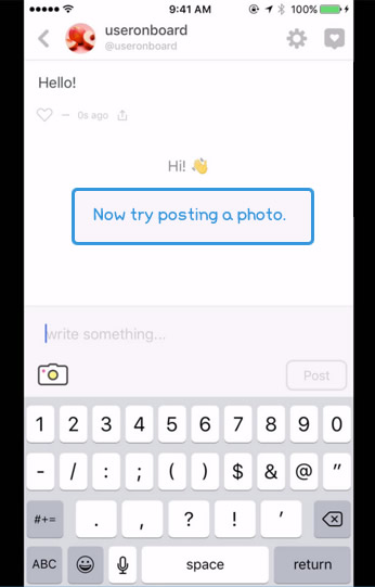
Image source: https://www.useronboard.com/
The process of ‘user onboarding’ – for both apps and on the web – is now recognized as an absolutely crucial part of keeping the users that you attract. It’s like having a tour guide to walk you through the app the first time.
Most onboarding processes sit on top of your app, so it’s often important to be able to identify this temporary guide from the actual app. Handwritten fonts are a good way of keeping a clear separation.
Simple Hand is highly legible, friendly, and approachable. In other words, perfect for the kind of conversational guidance required with onboarding.
Possible uses: Onboarding, schools, community services.
- By Side Project
- Link: HungryJPEG
- Price: $10
6. Monofor
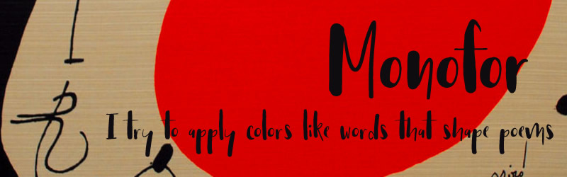
Monofor is a typeface that reminds me of the Spanish painter, Joan Miró. Like him, it’s lively and vigorous yet not aggressive. Somehow loose and direct at the same time.
Personally, I think there are far too many calligraphic ‘scrawl’ typefaces around at the moment, but Monofor stakes out some fresh, original ground.
Monofor strikes me as a good branding font that could be used across anything from menu headings, festival program guides or movie posters. Note that it includes an alternate letters version to add extra variety.
Possible uses: Food, art, festivals, tourism, wine, jazz, theatre.
- By Vuuuds
- Link: HungryJPEG
- Price: $10
7. Nexa Rust
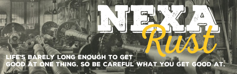
The rustic ‘workshop-made’ look has been a prominent in logo design for over two years. Though it can get a little overly cute at times, I think Nexa Rust manages to get the balance right – and provides plenty of variety too.
The Nexa pack comes with five variations:
- Slab: A distressed slab with shadow
- Sans: All uppercase sans-serif
- Script: A cursive face
- Handmade: A hand scrawl (I’m not a fan of this so much)
- Extras: Hand-cut rustic-themed decorations (hammers, farm tools, hot peppers)
Possible uses: Men’s hairdresser, clothing brands, leather goods, historical publications, automotive publications, organic produce.
- By Fontfabric
- Link: Fontfabric
- Price: $17 for the full set (or 5 for free)
Grab ’em
There you have it. Seven lovingly-crafted, original typefaces for your design delectation. Perhaps not a Magnificent Seven, but – at less than $20 each – I think you could argue they are a lucky seven.
Available during March only, The Hungry JPEG is offering a bundle that includes several of the fonts mentioned in this article, among other things. In total it includes over 38 fonts and 9 graphics packs. You can get it for just $29.
 Alex Walker
Alex has been doing cruel and unusual things to CSS since 2001. He is the lead front-end design and dev for SitePoint and one-time SitePoint's Design and UX editor with over 150+ newsletter written. Co-author of The Principles of Beautiful Web Design. Now Alex is involved in the planning, development, production, and marketing of a huge range of printed and online products and references. He has designed over 60+ of SitePoint's book covers.