Whether you run a small business with a few clients or a large corporation that targets thousands of people each day, your online presence is of the utmost importance. Having a cold, uninviting site is bad for business. This sends the wrong message to your visitors, can cost you their trust, and may even hinder your business growth. Many websites implement styles and techniques that help to make their websites friendlier and more inviting. If your website seems cold and unfriendly, you can use deliberate colors, shapes, and other techniques to make your site more inviting, trustworthy, and appealing.
Circles & Rounded Corners
 As web designers, we all know that all elements and containers are made up of boxes. Everything is inherently made of squares and rectangles. However, adding circular elements to your website can help to break the mold and make your website look friendly and more inviting. If you are worried about consistency across different browsers, don’t worry, you can implement rounded corners and even full circles in CSS. Simply use the border-radius style on the elements that you want to have rounded corners. You can round all of the corners at once, or you can round each one individually. You can also keep some square and some rounded. CSS gives you the flexibility that you’re looking for without compromising web standards. Here is how you do it:
#main{
width:400px;
height:400px;
border-radius:200px;
-webkit-border-radius:200px;
background:#555;
color:#fff;
text-align:center;
margin:auto;
}
#main p{
padding:170px 0px 0px 0px;
font-size:48px;
}
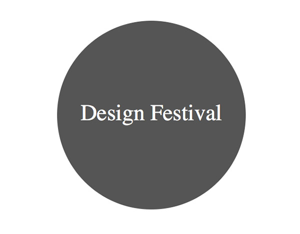
Lets says that the div that you want to make round has an id of main. Suppose it has a width and height of 400 pixels. If your want a circle created in CSS, all you have to do is create a border-radius amount that is half the value of the width and height, which is 200px. I set the background to grey and the text color to white. You can optically align the text by adding vertical padding.The result is shown below:
Bright Colors
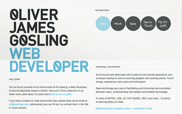
Using the right colors can have a tremendous impact on how your website is perceived. If you are looking for fun, friendly, and inviting, chances are that blood red and black aren’t a good combination to use. You would find those colors on a horror movie website. Instead, try using bright, lively colors in your site. There are thousands, even millions of color combinations out there, so experiment with different color schemes. If your brand’s colors are dark, all is not lost. You can easily add an accent color or two, as long as the main colors remain consistent with your brand.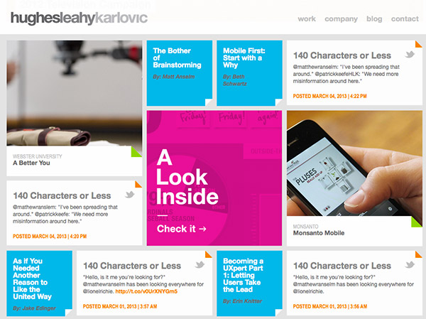 Hughes takes the normal corporate look and throws it out with this design. The magenta and cyan really play off of each other and add an element of fun to an otherwise bland color scheme. Notice the lime green and orange accents on the corners of each text box. The appearance is very playful for a company website.
 Feedstitch takes the concept of news feeds, which can be fairly complicated, and makes it fun with simple illustrations, a textured background, and a light and inviting color scheme.
Cartoons & Illustrations
Sometimes, it is just the style itself that needs to be more friendly. Instead of a minimalistic site that relies on flat colors and body copy, you might incorporate illustrated elements. Cartoons or illustrations might not work for every business, but if you want to appear to be fun and people-oriented then using an illustrated style may work wonders for your business. Here are some examples of websites with illustrations: The idea that portfolios should be neutral and boring is tossed out with Carbonmade’s website. The mix of fun illustrations on their homepage creates immediate interest for visitors.
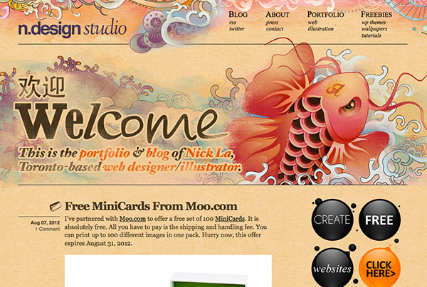 This website design is pretty famous by now, as the koi design is well composed and adds a lively, vibrant look and feel to the site. The mix of colors and the realistic traditional artistic style really gives this site a handmade feel.
 A popular website among designers and developers, Forrst uses a friendly illustration to entice professionals to request an invite. This is a good strategy, because requesting feedback for your work can be rather intimidating to some. The friendly illustration makes the site feel more inviting.
Humanized Written Copy
Many businesses focus on cramming as much industry-related jargon onto their site as possible (“We’re a global, end-to-end solutions provider for Fortune 500 companies and early-stage startups…“). I understand where they are coming from, because they are just trying to reinforce their credibility, but at the same time, all of that technical verbiage can be really intimidating for some people. If you are trying to focus on being people-friendly, then you may want to take a second look at your copy. The main page of your website should be simple, specific, and descriptive. You can save all of the technical jargon for deeper pages. If your words seem cold, some people may think that you only care about money and that they are just another number. Letting your visitors know that you actually care about them will go a long way in designing online friendliness.Friendly Images
Many websites use high-quality imagery to make a bold statement on their websites, but this glossy imagery isn’t always sending the right message. For example, let’s say you own a construction business and you build beautiful homes for people. You could showcase the beautiful homes that you have built on the homepage, which would look professional and would be a fairly good design choice. However, if you wanted to be even friendlier and create even strong appeal, you could instead choose images of people actually enjoying their homes. You could have images of a family at dinner, laughing and smiling, and having a good time in their wonderful new home. You could show a family enjoying their custom-built deck in the backyard, or a family enjoying themselves in a luxurious, beautifully built kitchen. Imagery can go a long way when it comes to making a personal connection. Images of beautiful homes are great, but it is hard for someone to make an emotional connection with bricks and wood. If you fill those homes with people living their lives, it makes it easier for the viewer to project themselves vicariously into one of those homes. Images like these can trigger a good memory or may be close to what someone has imagined for themselves once they buy a home and start a family. The image above shows palm trees and a relaxing sunset, which are good images to combine with the typically-stressful task to seeking payments. Instead of a hassle, this image reinforces the idea that you can relax and enjoy yourself while the payments roll in. This demonstrates a very smart, deliberate choice of imagery.
Conclusion
Creating a friendly website is great for business. You can be serious and show your authority in a given profession while being friendly at the same time. With the right combination of friendly text, imagery, shapes, and colors, you can create a sense of professionalism and fun (which are often seen as mutually exclusive opposites) simultaneously. Websites do not have to be cold and simply informational; getting visitors to open up and let their guard down will in fact increase conversions. Building trust and being persuasive can easily be accomplished with a beautiful, well-composed, friendly website. Do you have any examples of friendly websites to add? Do your clients often push you toward cold, unfriendly design choices due to company image concerns? Do you ever steer them towards more customer-friendly design choices?Frequently Asked Questions about Colors, Shapes, and Techniques for a Friendlier Company
What are the five universal shapes and how do they impact my company’s image?
The five universal shapes are the circle, square, triangle, cross, and spiral. Each shape has a unique psychological impact. For instance, circles represent unity and commitment, squares symbolize stability and balance, triangles are associated with power and progression, crosses signify relationships and faith, and spirals represent growth and evolution. Incorporating these shapes in your company’s design can subtly communicate these values to your customers.
How can color psychology be used to make my company appear friendlier?
Colors can evoke certain emotions and responses. For instance, blue is often associated with trust and reliability, while green can symbolize growth and freshness. Using these colors in your company’s branding can help create a friendlier and more approachable image.
What are some techniques to make my company’s branding more appealing?
Techniques such as using complementary colors, incorporating universal shapes, and utilizing space effectively can make your branding more appealing. Additionally, consistency in design across all platforms can help establish a strong brand identity.
How does the use of shapes in branding influence customer perception?
Shapes can convey certain messages and evoke emotions. For instance, circular shapes can suggest community and unity, while angular shapes can suggest stability and balance. Using these shapes strategically in your branding can influence how customers perceive your company.
What is the significance of the Platonic solid in branding?
Platonic solids are geometric shapes that are perfectly symmetrical and balanced. They can symbolize harmony and perfection, making them a powerful tool in branding. Incorporating these shapes in your design can communicate a sense of balance and harmony to your customers.
How can I use color and shape to differentiate my company from competitors?
By understanding the psychology of colors and shapes, you can use them strategically to create a unique and memorable brand identity. For instance, you might choose colors that evoke the emotions you want your customers to feel, or shapes that symbolize your company’s values.
How can I apply these techniques to my company’s website design?
You can apply these techniques by incorporating the appropriate colors and shapes into your website’s design. This could be through the use of color in your logo, the shapes used in your graphics, or the layout of your website.
What are some examples of companies that have effectively used color and shape in their branding?
Companies like Google, McDonald’s, and Coca-Cola have effectively used color and shape in their branding. Google uses primary colors in its logo to appear friendly and approachable, McDonald’s uses red and yellow to stimulate appetite and happiness, and Coca-Cola uses a distinctive cursive font and red color to evoke feelings of nostalgia and comfort.
How can I test the effectiveness of my company’s branding?
You can test the effectiveness of your branding through customer surveys, focus groups, or A/B testing. These methods can provide valuable feedback on how your branding is perceived and whether it effectively communicates your company’s values.
How can I update my company’s branding to be more modern and friendly?
To update your branding, consider current design trends and the psychology of colors and shapes. You might choose to incorporate more modern, minimalist designs, or use colors and shapes that evoke friendliness and approachability.
 James George
James George is a professional web developer and graphic designer. James is an expert in design, and a professional web developer, with a special interest in WordPress. Founder of Design Crawl, James has been a professional designer since 2005.