As a follow-up to the original post about 3 Common UX Gaffes and Easy Ways Around Them, I’ve compiled a list of some UX errors in email communication with users.
Today, I’d like to focus on the email unsubscribe flow and how too many companies are doing it wrong. At a time when our inboxes are absolutely overwhelmed (I’m at around 200 new emails per day now, 150 of which are from people), it’s important for companies to take extra care not to get on the users’ bad side – even though they are, at that moment, losing us as a subscriber.
Having built a mass-emailing engine in the past and having used it to bombard millions of users per month with my employer’s offers, I’ve tweaked our approaches for years and found that, beside good email design and decent proxies, a fluent unsubscribe flow can also improve conversion rate – even though you’re losing subscribers.
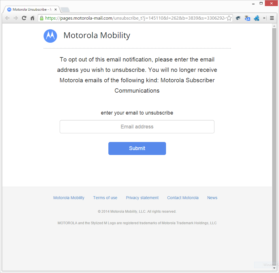
Enter Your Email to Unsubscribe
I opted to unsubscribe from most services and companies that don’t offer anything worthy of my attention this past weekend. One such company was Motorola which keeps spamming me with US-only offers, even though I indicated I wasn’t based in the US during the registration process.
That’s bad enough, UX wise, but how about this unsubscribe procedure?
The Problem
They already have my hash in the URL (I’m assuming one of those is a hash that tells them which of their recipients clicked the link in the email – otherwise, they have zero email analytics and it’s no wonder they couldn’t figure out I wasn’t US based), so they know precisely who is clicking on that link.
So, why ask me for an email address?
The Solution
The procedure to spare your users this is simple:
- When storing subscriber information, generate a hash for them.
- When sending out email campaigns, append this hash to all email links. Optionally, generate a fresh hash for every campaign.
- When the user clicks a link (like the Unsubscribe one), load their information from the system as per hash provided in the URL. Activate system permissions for email-based modifications only. Do not under any circumstances treat the hash as a session ID or anything else with security implication – you want to help your user to notification-related operations only.
- Apply appropriate operation to user (depending on clicked link).
Simple, safe, and user friendly. No extra step for users, and better analytics for you.
Login to Unsubscribe
Ok, I suppose loading the email into a field isn’t that much of a UX nightmare – it’s just one autocomplete click away, after all. So, what is a nightmare? How about this?
About.me is a “landing page for people” service where you can make a sort of “abbreviated view” of yourself for others to see. They can then follow links on said landing page to other resources related to you, all curated by you, of course.
About.me also sends out Weekly newsletters in which the information about who upvoted or visited your profile is. More often than not, this is plain annoying – especially if you have two accounts by mistake, like I do.
So I opted to unsubscribe.
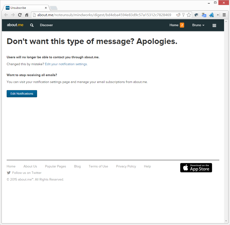
Uhh.. what? What do you mean “users”? I was sent a newsletter, no one contacted me. Yes, I want to stop receiving all email – just let me do that! Argh, okay, let’s “Edit Notifications”.
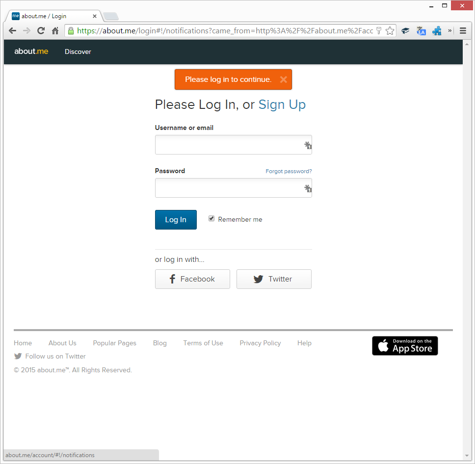
The Problem
The problem is that I now need to log in to a service I have long forgotten about, and I don’t feel like resetting my password just to unsubscribe from them (in case I’m not using a password vault like LastPass).
Heck, it’s so much easier to just click “report for spam” and solve the problem that way, which is how a service unwittingly ends up on spam lists and gets negative WoT reports.
The first screenshot is an unnecessary gateway to an even more unpleasant screen. You can see that certain notifications have been removed by just visiting the unsub link (“Users will no longer be able to contact you…”), so some email-related permissions were tweaked, whereas everything else needs a full login – an indication of ad-hoc development and no real architecture around this feature.
The Solution
The solution was mentioned in the previous section – just authenticate the user by the hash (notice how in the first screenshot above they even have my full username in the unsubscribe link) for email-related operations.
This is extremely easy if your app is using a good ACL approach (- and if it isn’t, what are you waiting for? Drop everything and get to work!) so just let the user tick off all emails he/she no longer wants to receive.
A stellar approach I don’t see a lot is using actions. Actions will let you embed buttons in your email that show up in Gmail (unfortunately only in Gmail) and perform a certain call to a certain endpoint of your definition.
While this has many applications outside unsub actions, imagine being able to just click an “Unsubscribe” action and be done with it! User friendliness to the max – that’s some Monday morning watercooler talk material for sure.
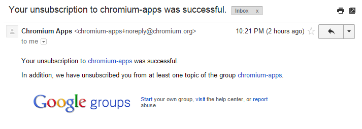
The only company I know that does this currently is, predictably, Google – most notably with Google Groups – but it does one thing wrong.
Which brings us to the next point.
The Unsubscription Confirmation Email
It’s all well and good when Google implements unsub simplifications methods like these, but confirming the action by sending yet another email – that’s unacceptable. Especially if the email has absolutely zero additional value.
The Problem
The problem is psychological. This is something a user who is unsubscribing simply doesn’t want. Chances are you’re dealing with an irate or angry user to begin with, one who is intent on cleaning their inbox, and here you are telling them what they already know.
This is like dropping a note to you neighbour asking them not to shortcut through your front garden – and them responding by shortcutting through your garden to tell you they won’t do it again. You’d feel rightly infuriatied.
The Solution
Don’t send unsubscription confirmation emails. Especially don’t ask people to confirm their unsubscription – never ask a person to click a link to unsub fully.
In 90% of the cases, they will report you for spam and lose all patience with you. When an unsub link is clicked, that’s where it should end. If you can use Gmail Actions to avoid opening a new tab – that’s the best approach – but opening a page with a simple, friendly “see ya” message is perfectly fine, too.
Other solutions
What else can you do to improve this flow?
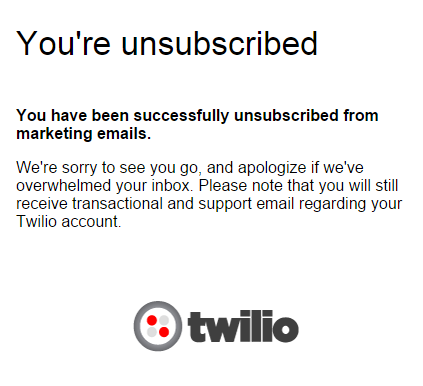
Be Direct and Cordial
Don’t waste the user’s time. Avoid walls of text, or trying to distract them with games or animations. Apologize for giving them reasons to unsubscribe, and do your best to part ways as friends. Perhaps next time you meet, the user will want to rekindle the flame of a now lost love. Twilio does this well.
Use Common Providers
There are many bulk sending agents out there, and many have extremely familiar unsub flows – flows that people are used to from unsubbing from other services. Find some decent examples here.
When the users unsub from your emails, they’ll enter a familiar workflow and know their way around, minimizing their frustration and potentially reversing their decision or at least getting them to tell you why they’re leaving – which brings us to…
Surveys
Some of the popular email marketing services offer unsubscribe surveys – short questionnaires that offer your users the chance to clarify why they’re leaving after they’ve already been unsubbed.
This is important – if you roll your own approach for this, do not neglect to unsub them first, and then ask them why. Never, ever blackmail them into telling you why before letting them leave – the unsubscribe action needs to be 100% unimpeded.
If you successfully include a pleasant mini-survey like this, you might find that your content simply needs a little bit of tweaking…
Offer Alternatives
If you’re running a website like SitePoint, and a user unsubs from a JavaScript newsletter, maybe they subbed to the wrong one to being with? Maybe they lost interest in this topic, but have developed one for another without being aware that you also offer other content?
Use the unsub confirmation screen to offer alternatives:
"We're terribly sorry the content of our JS newsletter was unsatisfactory. We'll do our best to be better in the future - you deserve the best! It's been an honor having you as a subscriber - we'd really love to keep you around! Would you be interested in our other newsletters more?

- PHP Newsletter
- Ruby Newsletter
- Web Newsletter
- HTML Newsletter

Or if you're still intending to leave, would you tell us what we did wrong? ..."
Basic rules of human interaction. Always blame yourself and “be lavish in your praise and hearty in your approbation”. You’d be surprised how much common courtesy and people skills influence conversion rates.
Offer Frequency Adjustments
Finally, it may be that you’ve simply overloaded the user’s inbox with you-related content. Like Google Groups and most forums out there, offer frequency adjustments. Suggest weekly or monthly digests instead of daily emails, and you’ll be amazed at how many people just want to bulk their updates into a longer “save for later” email, rather than being peppered by smaller messages.
Conclusion
It isn’t hard to escalate an unsubscribing user into a hostile state – users are picky and hounded by many services like yours on a regular basis. It probably isn’t personal — yet.
These might seem like minor details and nitpicking, but they do make a lasting impression and ruin second chances. Don’t make complicated what could be simple – don’t block access to features that need to be accessible with next to no permission, and your users will thank you.
No one will ever hate you for making it easy for them to request a shred of their privacy back, and smooth unsubscription flows are just that.
Do you think I’ve missed some common failures or tips? Let me know!
Frequently Asked Questions (FAQs) about UX Errors in Building Unsubscribe Flow
What are the common UX errors to avoid when building an unsubscribe flow?
The most common UX errors when building an unsubscribe flow include making the process too complicated, hiding the unsubscribe button, and not providing a confirmation message after the user has unsubscribed. These errors can frustrate users and damage your brand’s reputation. It’s essential to make the unsubscribe process as straightforward and transparent as possible to maintain a positive user experience.
How can I make the unsubscribe process user-friendly?
To make the unsubscribe process user-friendly, ensure that the unsubscribe button is easily visible and accessible. The process should be simple and require minimal steps. After the user has unsubscribed, provide a confirmation message to reassure them that the action has been successful. Offering an option to re-subscribe or adjust email preferences can also enhance the user experience.
Why is a confirmation message necessary after unsubscribing?
A confirmation message is necessary after unsubscribing to reassure users that their action has been successful. It eliminates any uncertainty and provides closure to the user. This message can also be used as an opportunity to thank the user for their time or offer them a chance to re-subscribe or adjust their email preferences.
How can I improve the design of my unsubscribe page?
Improving the design of your unsubscribe page involves making it visually appealing and user-friendly. Use clear and concise language, ensure the unsubscribe button is easily visible, and provide a confirmation message after the user has unsubscribed. You can also include options for users to adjust their email preferences or re-subscribe.
What are the best practices for email UX and design?
Best practices for email UX and design include making the unsubscribe process simple and straightforward, providing a confirmation message after unsubscribing, and offering options for users to adjust their email preferences or re-subscribe. The design should be visually appealing and the language used should be clear and concise.
How can I avoid frustrating users when they want to unsubscribe?
To avoid frustrating users when they want to unsubscribe, make the process as simple and straightforward as possible. The unsubscribe button should be easily visible and accessible, and a confirmation message should be provided after the user has unsubscribed. Avoid hiding the unsubscribe button or making the process too complicated.
Why is it important to offer options to adjust email preferences or re-subscribe?
Offering options to adjust email preferences or re-subscribe is important as it gives users control over what they receive from you. It shows that you value their preferences and are willing to accommodate them. This can enhance the user experience and potentially retain users who might otherwise unsubscribe completely.
How can I make my unsubscribe page visually appealing?
To make your unsubscribe page visually appealing, use a clean and simple design with a clear layout. Use colors and fonts that are consistent with your brand. The unsubscribe button should be easily visible and the language used should be clear and concise. A visually appealing unsubscribe page can enhance the user experience and leave a positive impression of your brand.
How can I ensure the unsubscribe process is transparent?
To ensure the unsubscribe process is transparent, clearly communicate what the user needs to do to unsubscribe and what will happen after they do so. Provide a confirmation message after the user has unsubscribed to reassure them that the action has been successful. Avoid hiding the unsubscribe button or making the process too complicated.
How can I use the unsubscribe page to maintain a positive relationship with users?
You can use the unsubscribe page to maintain a positive relationship with users by making the process as simple and straightforward as possible. Provide a confirmation message after the user has unsubscribed to reassure them that the action has been successful. Offer options for users to adjust their email preferences or re-subscribe. This shows that you value their preferences and are willing to accommodate them.
 Bruno Skvorc
Bruno is a blockchain developer and technical educator at the Web3 Foundation, the foundation that's building the next generation of the free people's internet. He runs two newsletters you should subscribe to if you're interested in Web3.0: Dot Leap covers ecosystem and tech development of Web3, and NFT Review covers the evolution of the non-fungible token (digital collectibles) ecosystem inside this emerging new web. His current passion project is RMRK.app, the most advanced NFT system in the world, which allows NFTs to own other NFTs, NFTs to react to emotion, NFTs to be governed democratically, and NFTs to be multiple things at once.