Sometimes, brands become so big and familiar that we no longer notice the nuances hidden within their logos. Large, established companies are often thought of as somehow less clever and creative than smaller, edgier startups. But, if you take a look at some of these old, familiar logos, you might discover some symbolism, tricks, and twists that you’ve been overlooking for years. Let’s have a look at twenty logos – ranging from simply “big” brands to ubiquitous companies – that have some hidden cleverness for the observant eye.
Tostitos
FedEx
Amazon
Atlanta Falcons
Baskin Robbins
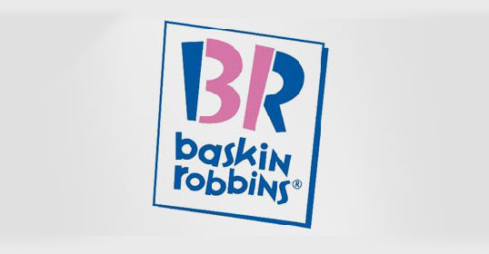 Baskin Robbins claims 31 unique flavors of ice cream, and they’ve made this claim a part of their branding as well.
Big Ten Conference
 The Big Ten Conference of US collegiate teams ran into quite the branding problem. They briefly had eleven teams. (Actually, they have twelve now after Nebraska joined in 2011, and they’ve apparently abandoned any hope of reconciling their total team tally with their brand name.) Negative space provides the opportunity to include all 11 teams.
Goodwill
London Symphony Orchestra
Milwaukee Brewers
Sun Microsystems
![]()
Sun Microsystems’ logo seems to spell the word “Sun” in endless circular (clockwise) sequences.
Elettro Domestici
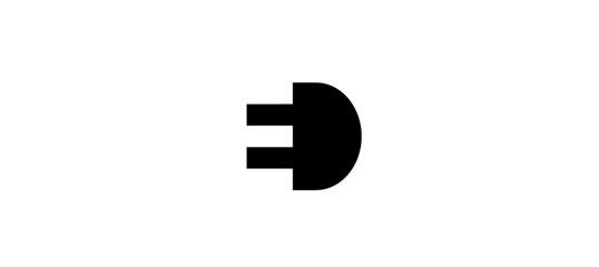 Through clever use of negative space, Elettro Domestici spells out “ED” while simultaneously showing an electric plug.
My Fonts
Hidden Cork
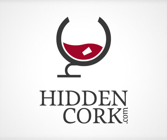 Hidden Cork’s logo forms a wine glass with the letters “H” and “C”. And, they hid their own cork through use of negative space.
The Installers
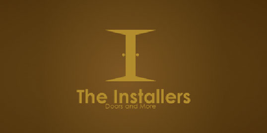 The Installers used their own installation of double doors (and a well-lit room behind them) to form a capital “I” through negative space.
Families
Snooty Peacock
Unilever
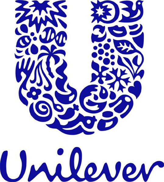 Unilever has 24 different facets to their business, and each of them is represented withing the greater “U” of their brand.
Sony Vaio
Elefont
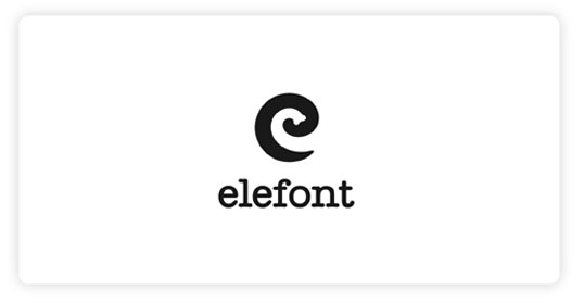 Elefont not only chose a remarkable font for their logo, they also found room for a lowercase “e” and an elephant’s trunk.
Hope For African Children Initiative
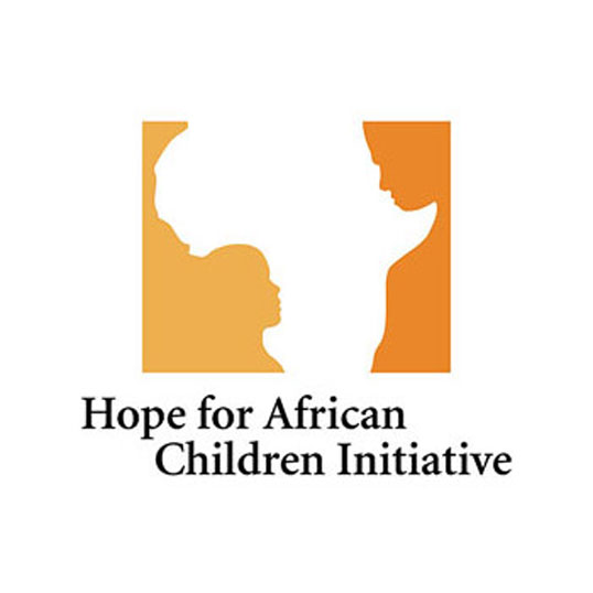 The Hope for African Children Initiative’s brand clearly contains the continent of Africa, but it also includes a child and an adult facing each other within the negative space.
Did you discover some new tricks within seemingly-familiar logos? Do you think large organizations still have room for cleverness within their branding, or does it detract from their hard-earned authority and size?
The Hope for African Children Initiative’s brand clearly contains the continent of Africa, but it also includes a child and an adult facing each other within the negative space.
Did you discover some new tricks within seemingly-familiar logos? Do you think large organizations still have room for cleverness within their branding, or does it detract from their hard-earned authority and size?
Frequently Asked Questions (FAQs) About Hidden Cleverness in Big Brand Logos
What is the significance of the arrow in the FedEx logo?
The arrow in the FedEx logo is a hidden design element that represents speed and precision, both key aspects of the company’s courier services. It’s formed by the negative space between the ‘E’ and the ‘x’. This clever design was created by Lindon Leader of Landor Associates and it’s a great example of how a simple logo can convey a powerful message about a brand’s values and services.
What does the spoon in the FedEx logo mean?
Contrary to some beliefs, there is no spoon in the FedEx logo. The supposed ‘spoon’ is actually part of the ‘e’ in FedEx. The confusion may arise from the unique font and design of the logo. The main hidden element in the FedEx logo is the arrow, not a spoon.
Are there any hidden elements in the Amazon logo?
Yes, there are hidden elements in the Amazon logo. The yellow arrow in the logo starts at the letter ‘a’ and ends at the letter ‘z’, signifying that Amazon provides a wide range of items for sale, literally from A to Z. The arrow also forms a smile, indicating the company’s commitment to customer satisfaction.
What is the hidden message in the Baskin Robbins logo?
The Baskin Robbins logo cleverly incorporates the number 31, which is a nod to the company’s original concept of offering 31 flavors of ice cream, one for each day of the month. The number ’31’ is embedded in the ‘B’ and the ‘R’ of the logo, showcasing the brand’s creativity and attention to detail.
What does the hidden bear in the Toblerone logo represent?
The hidden bear in the Toblerone logo is a tribute to the town of Bern, Switzerland, where Toblerone originated. Bern is often called the city of bears, and the bear image is cleverly hidden in the mountain design of the logo.
Is there a hidden symbol in the Starbucks logo?
The Starbucks logo doesn’t have a hidden symbol per se, but it does have an interesting backstory. The logo features a twin-tailed mermaid, or siren, which was chosen to represent the seductive power and allure of the sea, reflecting the seafaring history of coffee and the brand’s nautical theme.
What’s the hidden meaning in the Hyundai logo?
The Hyundai logo may look like a simple ‘H’, but it’s actually a stylized representation of two individuals shaking hands. One represents the company and the other represents a satisfied customer, symbolizing the mutual trust and satisfaction between the two.
What does the hidden arrow in the Hershey’s Kisses logo represent?
The hidden arrow in the Hershey’s Kisses logo can be found in the negative space between the ‘K’ and the ‘I’. While it doesn’t have a specific meaning, it adds a fun and clever element to the logo, making it more memorable.
What’s the hidden message in the Cisco logo?
The Cisco logo represents the Golden Gate Bridge, a famous landmark in San Francisco, where the company was founded. The name ‘Cisco’ itself is also a shortened form of ‘San Francisco’. The lines in the logo are meant to mimic the frequency lines of an electromagnetic wave, reflecting the company’s focus on networking and telecommunications.
Is there a hidden element in the Pinterest logo?
Yes, the Pinterest logo has a hidden element. The ‘P’ in Pinterest is designed to look like a pin, which is fitting for a platform that allows users to ‘pin’ or save content they find interesting. This subtle design element reinforces the brand’s purpose and functionality.
 Isabelle Try
Isabelle is a design writer based out of Australia.