
You never want your web visitors to wait. Some argue that the use of a loading screen on your website is unnecessary and can potentially discourage your visitors. Others contend that with ever-quickening connection speeds and a distinct need to stand apart, well-designed immersive websites are well worth the wait. Regardless of where you stand on the matter, it is hard not to appreciate a clever, creatively-designed loading screen that transforms a test of patience into something playful and captivating. From hand-drawn designs to loading screens that implement 3D elements, there is a multitude of ways to design an clever preloader. If you have ever thought about adding a loading screen to your website, this is the showcase for you. Today, I share 12 inspirational loading screen animations that will hopefully fuel your imagination and inspire you.
SectionSeven Inc.
 SectionSeven’s site is already visually creative given its unorthodox horizontal scrolling. Their loading screen furthers the creative look and design by using vertical lines. While the site loads, various lines in various colors begin to grow from the bottom of the screen to the top. It’s a simple but effective design.
Escriba
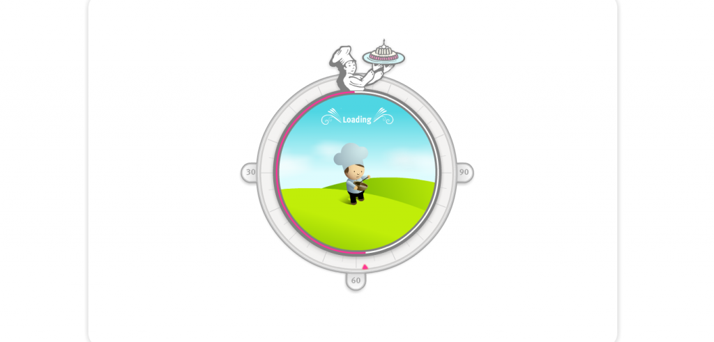 It’s always a good idea to try to brand and contextualize your website elements. Escriba’s loading screen makes perfect sense for the website as a whole. Their loading image uses a cute chef character who is baking. To top it off, when the loading finishes a “ding” noise reminiscent of a cooking timer is heard.
ZZZ
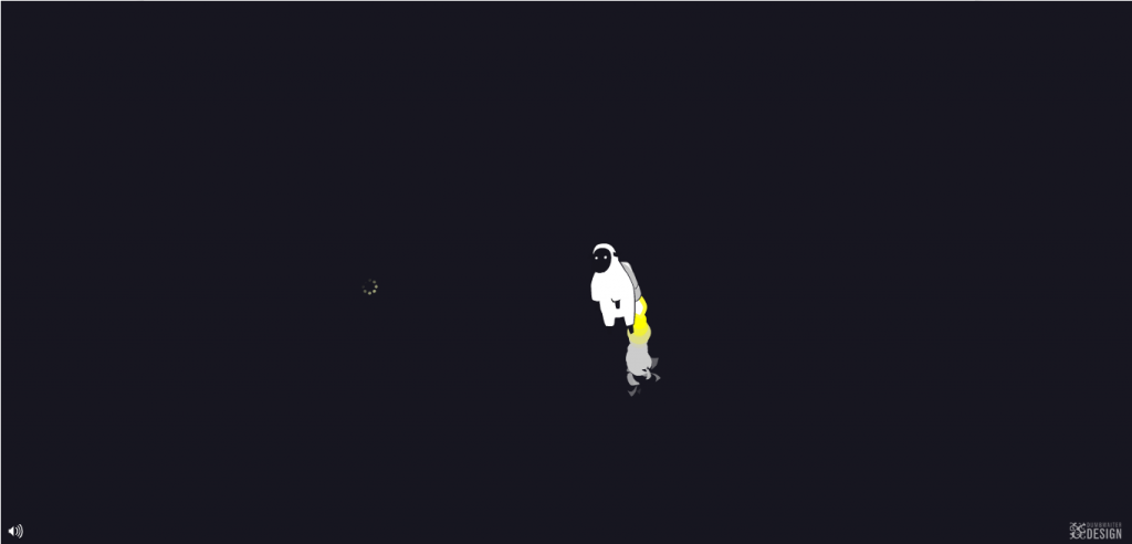 Your loading screen doesn’t always have to stay in the center of your screen. If you’re creative enough you can very easily have the loading utilize the entire space. ZZZ’s achieves this very easily with the use of color and movement. The sheep, the clouds, and the moon complement the night sky.
Max Shaman
 Shaman’s site as a whole is wonderfully inspiring. The treatment of the loading page is a great touch, because not only does the moderately-creepy voodoo doll show up on the screen, but it appears even bigger on the actual website itself, needles and all.
Platin
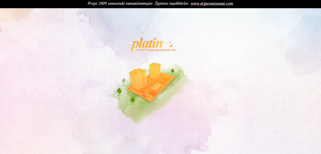 A great way to design your loading page is by utilizing an element that can grow, developed, or transform as your site loads. This conveys that the site is loading and gives the visitor the indication of progress. Platin does this perfectly with their watercolor-esque design of a building that begins to be surrounded by growing trees.
Museum of Science and Industry
 Depending on your website’s targeted demographics and subject matter, you can get away with using a cute character to attract attention and entertain the visitor briefly until your site is finished loading. The MSI does this on their website by having an appealing character dance as the site loads.
Food of the Food
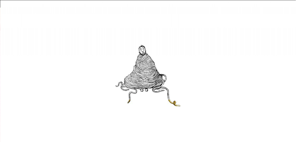 It isn’t unheard of to create strange and maybe unsettling designs whether for print or web. You might also incorporate hand-drawn elements into your website. Food of the Food accomplishes both simultaneously. The character is entangled in spaghetti; as they look on in peril, the hand-drawn image is slowly filled with color to indicate the loading time of the site before completing the homepage.
Erky Perky
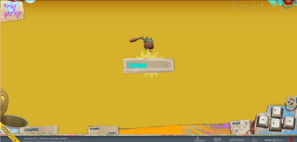 Erky Perky’s website has great graphics, attractively designed characters, and an all around sharp preloader design. You can’t help but be intrigued by their little caveman character running on top of the loading bar.
Xixi No Banho
 Simple solutions can make for superb designs, and choosing simplicity doesn’t mean that visitors will be less impressed. Banho’s loading screen is simplistic but well beyond the standard, uninspired progress bars. The bright and welcoming colors of the site itself is perfectly paired with the loading bar. The animation added once the site is finished loading is testament to what is in store for those who actually explore this exceptionally creative site.
Mary and Max
 If you are into films and animations, then you are no stranger to loading screens. More often than not, websites for visual entertainment will feature some form of preloading graphic before the homepage. This is no different for the Mary and Max site. The loading image is a simple yet engaging with the use of a retro-inspired television screen that broadcasts a countdown until the site loads.
W. Brett Wilson
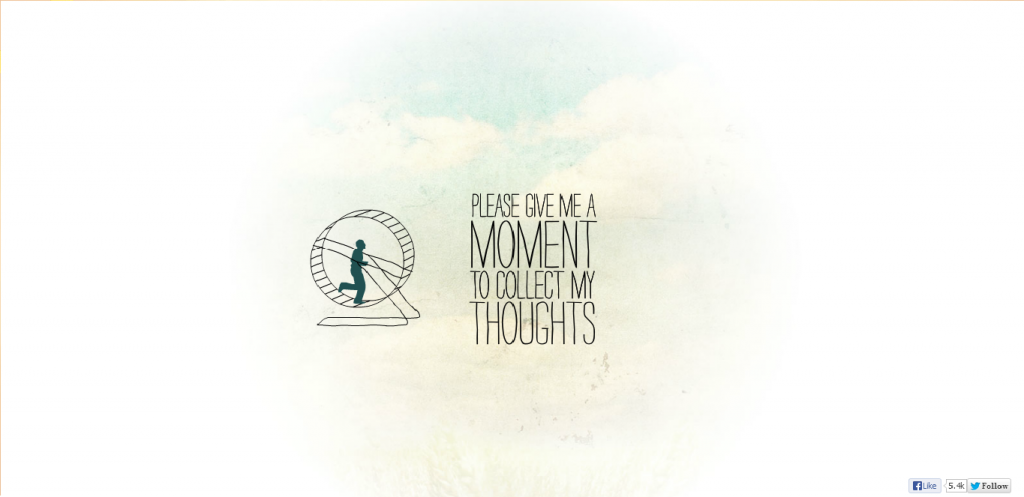 Another simple but clever loading screen can be found on W. Brett Wilson’s website. The site itself is creatively designed, and when you explore it you will find that the loading image makes perfect sense. The simple animated graphic of a man running on a hamster wheel creates a relatable context.
Identification05
 Identification05’s 3D graphics and jumping character is truly inviting. The site quickly loads similar graphics and characters. Pair that up with the well-chosen music, sound effects, and color choices and you end up with an artful website.
What do you think about websites using loading screens? Should you avoid them at all costs, or are there ways to turn a tedious loading time into a clever introduction? Do you have any favorites above?
Identification05’s 3D graphics and jumping character is truly inviting. The site quickly loads similar graphics and characters. Pair that up with the well-chosen music, sound effects, and color choices and you end up with an artful website.
What do you think about websites using loading screens? Should you avoid them at all costs, or are there ways to turn a tedious loading time into a clever introduction? Do you have any favorites above?
Frequently Asked Questions about Creative Preloader Designs
What are the key elements to consider when designing a preloader?
When designing a preloader, it’s important to consider several key elements. Firstly, the design should be simple and clean, avoiding any unnecessary clutter that could distract the user. Secondly, the preloader should provide some form of feedback to the user, such as a progress bar or a percentage indicator, to let them know how long they have to wait. Thirdly, the design should be consistent with the overall look and feel of the website or app, ensuring a seamless user experience. Lastly, the preloader should be optimized for speed, as a slow preloader can frustrate users and lead to higher bounce rates.
How can I make my preloader design more engaging?
There are several ways to make your preloader design more engaging. One effective method is to use animations or motion graphics, which can add a dynamic element to the preloader and keep users entertained while they wait. Another approach is to incorporate branding elements into the design, such as the company logo or brand colors, which can help reinforce brand identity and create a more cohesive user experience. Additionally, using creative and unique designs can help your preloader stand out and leave a lasting impression on users.
What are some common mistakes to avoid when designing a preloader?
Some common mistakes to avoid when designing a preloader include making the design too complex, not providing enough feedback to the user, and not optimizing the preloader for speed. A complex design can confuse users and detract from the overall user experience, while a lack of feedback can leave users unsure of how long they have to wait. Additionally, a slow preloader can frustrate users and lead to higher bounce rates, so it’s important to ensure your preloader is optimized for speed.
How can I test the effectiveness of my preloader design?
Testing the effectiveness of your preloader design can be done through user testing and analytics. User testing involves observing how real users interact with your preloader and gathering their feedback, while analytics involves tracking key metrics such as load times and bounce rates. By combining these two methods, you can gain a comprehensive understanding of how well your preloader is performing and identify any areas for improvement.
Can I use a pre-made preloader design or should I create my own?
Both options have their pros and cons. Using a pre-made preloader design can save you time and effort, and there are many high-quality designs available to choose from. However, creating your own preloader design allows you to fully customize the look and feel to match your brand, and can help your website or app stand out from the competition. Ultimately, the decision should be based on your specific needs and resources.
What are some examples of creative preloader designs?
There are many examples of creative preloader designs out there. Some use clever animations or motion graphics to entertain users while they wait, while others incorporate branding elements to reinforce brand identity. Some designs even turn the preloader into a mini-game, providing a fun and engaging user experience. You can find many examples of creative preloader designs on design inspiration websites like Dribbble or Pinterest.
How can I optimize my preloader for speed?
Optimizing your preloader for speed can be achieved through several methods. One approach is to minimize the size of your preloader by using simple designs and optimizing any images or animations. Another method is to use efficient coding techniques to reduce the amount of processing power required. Additionally, using a content delivery network (CDN) can help speed up load times by serving your preloader from a server that’s geographically close to the user.
How can I incorporate branding elements into my preloader design?
Incorporating branding elements into your preloader design can be done in several ways. One approach is to use your brand colors in the design, creating a cohesive look and feel. Another method is to include your company logo in the preloader, which can help reinforce brand identity. You could also use typography or imagery that’s consistent with your brand style, creating a seamless user experience.
What are some resources for preloader design inspiration?
There are many resources available for preloader design inspiration. Websites like Dribbble and Pinterest have vast collections of preloader designs, ranging from simple and clean to complex and creative. Additionally, design blogs and magazines often feature articles on preloader design trends and showcase examples of innovative designs. You can also look at popular websites or apps to see how they’ve designed their preloaders.
How important is a preloader in the overall user experience?
A preloader plays a crucial role in the overall user experience. It serves as a visual indicator that the website or app is loading, providing reassurance to users that something is happening in the background. A well-designed preloader can keep users engaged during load times, reducing the chance of them leaving out of frustration. Additionally, a preloader that’s consistent with the overall look and feel of the website or app can enhance the overall user experience, creating a seamless and cohesive journey for the user.
 Gabrielle Gosha
Gabrielle is a creative type who specializes in graphic design, animation and photography.