Most of the readers on DesignFestival probably already know which colors to avoid in advertising, so for those of you who fall into this category, this article is simply to give you a bit of humor to brighten your day. However, if you are still new to advertising, or maybe there is a color combo or scheme you absolutely love but can’t seem to find success with, perhaps this article will help you see why certain colors are so bad for advertising. You may also want to check out some color scheme apps for helping you choose better color combinations. I’m a big believer in color. I would go so far to say that all colors are beautiful, even the ones I don’t relate to very well. In combination with the right colors, they can be even more appealing and produce the right feelings in a target audience. In combination with the wrong colors, however, or used in the wrong way, all colors have the potential to simply be obnoxious. In fact, some advertisers seem to use bright, neon, abrasive, or even mismatching colors in a lazy attempt to capture attention. The problem is that these colors may initially grab attention but ultimately damage the brand and the credibility of the offer. The following are some of the worst uses of color in advertising, both online and in print. Glance through and make sure you aren’t using any of the following simply as a short-term strategy to attract attention.
1.) Green, Yellow, or Purple on a Green Background
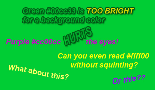
 You would think that putting two colors of almost identical hues on top of one another would be common sense, but apparently it still happens. In this ad, it is understandable what the marketer was trying to accomplish — green and yellow are sensible choices for a landscaping ad. However, using only these colors on an ad makes it highly unreadable, both on print and on the web. The colors are simply too close together.
In fact, the worst colors to use on a green background are most shades of green, yellow, or purple. If done with the exact right shades, purple and green can create an intense design. But purple text on a green background are just that — too intense to be easily read.
You would think that putting two colors of almost identical hues on top of one another would be common sense, but apparently it still happens. In this ad, it is understandable what the marketer was trying to accomplish — green and yellow are sensible choices for a landscaping ad. However, using only these colors on an ad makes it highly unreadable, both on print and on the web. The colors are simply too close together.
In fact, the worst colors to use on a green background are most shades of green, yellow, or purple. If done with the exact right shades, purple and green can create an intense design. But purple text on a green background are just that — too intense to be easily read.
2.) Light Colors on a White Background
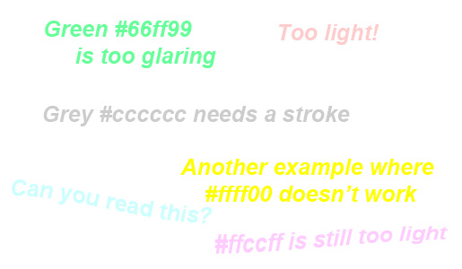
 White is already light, so adding light-colored text such as green or yellow on a white background is going to create readability issues. Thankfully, the website above didn’t go with this original design, probably due to the bad color combo. Bold text helps a little, but not much. It is always best to stick with darker shades of grey or black with white.
3.) Neon or Rainbow Colors
 Both neon and rainbow color combinations are definitely eye-catching. But beyond this, they are aversive and very irritating. They tire our eyes very quickly, and mostly just end up causing annoyance instead of more positive feelings that companies want customers to associate with their brand.

4.) Colored, Textured Background with Colored Text
 This is another green-on-green example that is could have been better. I’m not sure why this seems like such a common marketing mistake, except that maybe green is just a likeable and versatile color. But, even the best colors can be too much if implemented the wrong way. What I want to point out in this example is just how unreadable colored text is when placed directly on a highly textured background, especially one with a strong color. Turn down the opacity, if you must place text directly on an image. Or, place the text in a box where you have better control of the background.


5.) Red, Blue, or Purple on Black Background
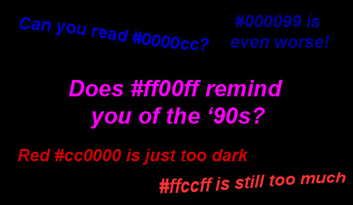
 Unless you really want to push the goth look, avoid red on a black background, even with images. Blue and purple are just as bad. Text in these colors on a black background are also completely unreadable. In fact, almost any color of text on a black background is hard to read, even white. Usually, you should use colored or white boxes if you need to put more than a line of text on a black background. Black is simply too strong of a color and overpowers every other color on the page.
6.) White Gradient with White Text
 Gradients are terrific when used well, but as a quick trick to draw attention, it usually ends up hurting a design more than helping it — and even more so when you use the same color for both the gradient and text. And, I’d advise that you don’t ever use more than one gradient in a single advertisement.
7.) Multiple Colored Boxes
 Too many different colors look bad, no matter which colors are used. Lots of hues confuse the eye, so readers don’t know where to start first. This is why one of the rules for good design is to limit the number of colors to two or three, and on rare occasion, four.

8.) Yellow, Blue, and Magenta on Red Background
 Yes, yellow contrasts well with red. But in the case of a wall of text, yellow and red simply are not an appealing combination. I get a little dizzy looking at the website above, in fact. Not many designers can pull off a red background well. Just as with black, it is very overpowering and hard to balance well with other colors. And, the shade of red in the website above, #ff0000, should never be used in such large amounts.
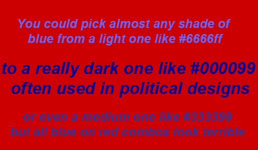
 Most designers know that blue and red are the worst color combinations possible when it comes to text, and especially blue text on a red background. The colors are both too strong and fight to overpower each other, which plays tricks with our eyes. In the example above, they also place a magenta box on the red background…not advisable. Red and magenta get placed together way too often, in my humble opinion. They are two colors that clash terribly and are no-no’s in any use, not just ad design.
9.) Bright Blue Background
Now I’m not saying that all websites with blue backgrounds are bad. In fact, some are quite brilliant. But, bright blue is another color that is just too strong for a background if not designed well. In small amounts or as text on a light background, it can be striking. Or, even just a slightly darker shade of blue works well in large color blocks. The brighter and closer to neon it gets, though, the harder it is to look at for long periods of time. As you can see with the above example, not even black looks good with such a bright background, not to mention a few other obvious improvement areas.
10.) Pale Yellow Background
 The shade of yellow used in the above website is great in small amounts used in combination with brown or dark red for, say, a retro look. But, as the entire background, it simply comes across as a very unappealing hue. Yellow is supposed to cause feelings of happiness, childlike bliss, etc. This website certainly doesn’t entice such feelings, nor does the following mock bad website designed in dull orange:
 Are there any other colors or color combos that you absolutely abhor? Please help make the world a more beautiful place by exposing these poor design practices in the comments below.
Frequently Asked Questions (FAQs) About Troublesome Colors in Advertising
Why are certain colors considered troublesome in advertising?
Certain colors are considered troublesome in advertising because they can evoke negative emotions or reactions from the audience. For instance, colors like brown and gray can be perceived as dull or depressing, while neon colors can be harsh on the eyes and distracting. It’s important to understand the psychological impact of colors when creating an advertisement to ensure it effectively communicates the intended message and appeals to the target audience.
How can I choose the right color combination for my advertisement?
Choosing the right color combination for your advertisement involves understanding your brand, your target audience, and the message you want to convey. It’s important to consider color psychology, cultural associations, and accessibility. Tools like color wheels and color scheme generators can also be helpful in finding harmonious color combinations.
What are some examples of bad color combinations in advertising?
Some examples of bad color combinations in advertising include red and green, blue and orange, and black and brown. These combinations can be hard to read, visually jarring, or evoke negative emotions. However, it’s important to note that context and execution can also play a role in how these combinations are perceived.
How does color psychology impact advertising?
Color psychology plays a significant role in advertising as different colors can evoke different emotions and reactions. For instance, red can evoke feelings of excitement or urgency, while blue can evoke feelings of trust and reliability. Understanding color psychology can help advertisers choose colors that align with their brand message and appeal to their target audience.
Are there any universal rules for color combinations in advertising?
While there are no universal rules for color combinations in advertising, there are some general guidelines to follow. These include avoiding combinations that are hard to read, considering color psychology, and ensuring your color choices align with your brand identity. It’s also important to consider accessibility and how your colors will appear to those with color vision deficiencies.
How can I test the effectiveness of my color choices in advertising?
You can test the effectiveness of your color choices in advertising through methods like A/B testing, where you create two versions of an advertisement with different color schemes and see which performs better. You can also gather feedback from your target audience or use analytics to see how your advertisement is performing.
Can I use troublesome colors effectively in advertising?
Yes, troublesome colors can be used effectively in advertising if used thoughtfully and in the right context. For instance, neon colors can be effective for grabbing attention if used sparingly and in the right setting. It’s all about balance and understanding how different colors interact with each other and with your audience.
How can I ensure my advertisement is accessible to those with color vision deficiencies?
To ensure your advertisement is accessible to those with color vision deficiencies, you can use tools like color contrast checkers to ensure your text is readable against your background color. You should also avoid relying solely on color to convey information, as this can be missed by those with color vision deficiencies.
How do cultural associations with colors impact advertising?
Cultural associations with colors can greatly impact how your advertisement is perceived. For instance, in some cultures, white is associated with purity and innocence, while in others it’s associated with mourning. It’s important to understand the cultural context of your target audience when choosing colors for your advertisement.
How can I learn more about color theory and its application in advertising?
There are many resources available to learn more about color theory and its application in advertising. This includes books, online courses, and articles. You can also seek advice from professionals in the field or study successful advertisements to see how they use color effectively.
 Tara Hornor
Tara Hornor has a degree in English and has found her niche writing about marketing, advertising, branding, graphic design, and desktop publishing. She is a Senior Editor for Creative Content Experts, a company that specializes in guest blogging and building backlinks. In addition to her writing career, Tara also enjoys spending time with her husband and two children.